|
|
| no title | ||
 |
||
| Previous Image | Next Image | ||
|
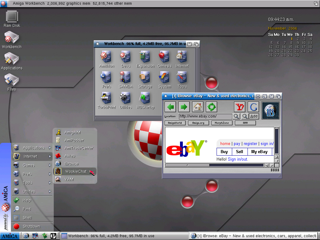
Description: I just can't stop "tweaking" things! Switched from 'StartMenu' to Darius Brewka's 'AmiStart' (with a new set of graphics, of course). The icons are from my 256 color set, but with a drop shadow added and saved as PNG (just something I'm experimenting with). The background was stolen from Kde-Look.org and modified to be more Amiga-like. Picture Stats: Views: 3194 Filesize: 233.05kB Height: 768 Width: 1024 Posted by: klesterjr at November 01, 2006, 06:30:16 PM Image Linking Codes
|
||
| 0 Members and 1 Guest are viewing this picture. |
| Vlabguy1 Posts:1262 | December 31, 2006, 03:50:44 AM Very NICE I like it much. Would like to know details on what set-up etc. Thanks Rich |
| klesterjr Posts:196 
| December 13, 2006, 04:45:38 PM Icon by icon. They're PNG versions of my 256 color icons. They were pretty much created for that screenshot (since I prefer dual-image icons) -- just curious to see what they would look like. Another screenshot showing the same icons without the drop shadow. |
| AMIGA-FAN Posts:149
| December 09, 2006, 01:47:30 PM Really nice. I have a querstion: how did you put those nice dropshadows on those icons, did you use a Paint program and worked (icon by icon) to put the shadows on each and every one of them or is there a hack to do it automatically?. |
| mr_a500 Posts:865
| November 05, 2006, 01:37:10 PM Quote On the other hand -- I do agree with you about the MUI gadgets, etc. I've tried several times to paint replacement gadgets, but have never been able to figure out the MUI palette. Yeah, MUI palette mapping is a real pain in the ass. You have to look at the ImageDesign picture in MUI/Docs - but even then it can be confusing (I've never been able to use the colour labelled "Brown" in ImageDesign) |
| klesterjr Posts:196
| November 05, 2006, 01:24:57 PM Quote ... and hopefully you're posting to get honest constructive opinions, not just praise. Heh, heh -- nope, just the praise thing! ;-) Some of your criticisms are just differences in taste. For instance, I LOVE startmenus and HATE antialiased type. On the other hand -- I do agree with you about the MUI gadgets, etc. I've tried several times to paint replacement gadgets, but have never been able to figure out the MUI palette. Thanks for the comments. -Ken |
| mr_a500 Posts:865
| November 05, 2006, 10:33:33 AM @klesterjr Oh - you're Ken of "Ken's Icons" fame? Your icons look great. You're quite an icon artist. I was thinking of making 16-colour versions of some of your icons. :-) That "Start menu" makes me cringe though. It's not bad if you like "Start menus", but I've always hated the Windows "Start menu". (I hate Windows so I'd never make my Amiga "Windows-like") Also, you should fix up your IBrowse buttons, layout and MUI elements. They look a bit flat and bland. Some better fonts or font anti-aliasing would be good too. (..just my opinion - and hopefully you're posting to get honest constructive opinions, not just praise. Some people are offended when they hear an honest negative criticism, but I'm more disappointed when people don't tell the truth about how they feel.:-)) |
| Amigaz Posts:1959 | November 03, 2006, 07:42:16 PM @klesterjr :cheers: again |
| klesterjr Posts:196
| November 03, 2006, 06:54:35 PM I fixed the 'Machine' wallpaper -- try downloading it again. http://www.five-star.com/stuff/machine.png Also modified another KDE-Look wallpaper. http://www.five-star.com/stuff/curve.png -Ken |
| klesterjr Posts:196
| November 02, 2006, 06:52:25 PM Oops! Amistart files are here: http://www.five-star.com/stuff/amistart.lha BTW -- just e-mailed you (guess I was too slow!) |
| Amigaz Posts:1959 | November 02, 2006, 06:47:53 PM @Ken The download links for the AmiStart and VisualPrefs/Birdie imaz themes are the same..can you please correct it? |
| Amigaz Posts:1959 | November 02, 2006, 06:13:44 PM Again your gui stuff really shines, great stuff Ken...please continue creating these nice looking themes :-) |
| klesterjr Posts:196
| November 02, 2006, 01:38:02 AM Let's see if I can remember everything . . . I uploaded the wallpaper at the same time as the screenshot, but it didn't seem to make it (too big, maybe?). Anyway, you can download it here. VisualPrefs is used to change the look of the gadgets, etc. -- using a gadget-set patterned after the "ZAmi" theme available for OS4 (I call it "imAZ"). Download it here. The startbar is AmiStart (as I mentioned in my first post). You can download the images I painted for it here. The dropshadow on the window titles is created with a utility called TitleShadow. The dropshadows on all the other text is created with a utility called OutlineFont run in User-Startup with: "Run > nil: OutlineFont 2 1 1 SHADOW" (assuming you put it in 'C' or somewhere in the system path). Oh yeah, the icons are Ken's Icons v3.0. You can download the preview set here. I think that's about it. Let me know if I've forgotten anything. BTW, the stuff of mine that I linked to is in a temporary directory -- so download it now if you think you want it. |
| keropi Posts:2466 | November 01, 2006, 06:45:58 PM nice! well done! now post what patches you used to make it look like it! and upload the background here too! :-D :-D :-D |