|
|
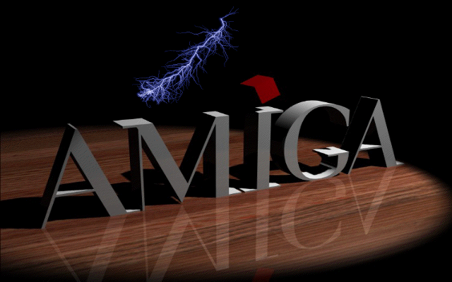
| Very Kool Logo | ||
 |
||
| Previous Image | Next Image | ||
|
Description: I found this render on the net. I really liked it but felt it was missing something so I added the lightning bolt using ImageMasterR/T.
Picture Stats: Views: 4046 Filesize: 77.82kB Height: 768 Width: 1024 Posted by: JC at May 24, 2003, 08:32:52 PM Image Linking Codes
|
||
| 0 Members and 1 Guest are viewing this picture. |
| AMC258 Posts:877 
| February 12, 2007, 02:22:27 AM The grey is alright, but the lighting is horrible. The lightning does look very odd. |
| weirdami Posts:3776 | January 12, 2007, 01:17:56 AM is that one of those scragly feathers floating down onto the amiga? |
| dbrads Posts:117 | September 18, 2006, 07:07:01 PM I love it! I have saved it and I am using it as my wallpaper on my Pee Cee. :lol: |
| HopperJF Posts:1531
| October 17, 2004, 03:31:36 PM I like this! The grey ruins it a bit, white or brushed steel affect would look nicer |
| that_punk_guy Posts:4526
| February 22, 2004, 12:13:40 AM Could do with some blue glow from behind the text maybe, to show the devastating effects of that lightning bolt! |
| Animagic Posts:441 | October 27, 2003, 02:49:13 PM simple ... is ... brilliant! |
| Mike_Amiga Posts:1448
| August 14, 2003, 12:55:39 PM Wicked piccy, shame the logos so grey. Suppose one could always alter that in Photoshop tho. ;-) |