|
|
| AMIGATOR | ||
 |
||
| Previous Image | Next Image | ||
|
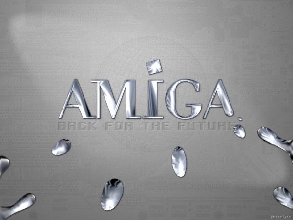
Description: This is was one of my old contributions to AmigaOS4. It's over a year old, so I'm releasing it before it becomes old fashion! ps: There won't be a Terminator 4 ;-) SimoAmi Picture Stats: Views: 3543 Filesize: 26.95kB Height: 768 Width: 1024 Posted by: SimoAmi at September 09, 2003, 12:24:11 PM Image Linking Codes
|
||
| 0 Members and 1 Guest are viewing this picture. |
| weirdami Posts:3776 | September 26, 2005, 11:38:45 PM There is just enough. What you are seeing are the effects of fish-eye lens closeupiness. Those blobs are really small, they just look big because they are so close. :-) |
| that_punk_guy Posts:4526 
| February 22, 2004, 02:30:51 AM My only criticism would be that there appears to be far too much liquid metal on its way back to complete the logo... where will the surplus go? |
| Lo Posts:713
| January 14, 2004, 05:01:28 AM Hey, Nice! Now, can you make that Amiga Logo look like it is dripping? Heavy Metal! woo-woo 8-) |
| lempkee Posts:2860
| September 17, 2003, 03:26:34 PM i LIKE IT! ....i liKE IT ALOT! |