Welcome, Guest. Please login or register.

Author Topic: Logos vs Mascots (AROS)  (Read 19701 times)

Description:

0 Members and 1 Guest are viewing this topic.

Offline anglosaxonusaTopic starter

  • Newbie
  • *
  • Join Date: Dec 2010
  • Posts: 33
    • Show all replies
Logos vs Mascots (AROS)
« on: December 09, 2010, 10:27:22 PM »
Think back to the first computers you knew.  For many, their first acquaintance came in the 1980s.  I can recall my first encounter in a school library on a rainy day with an Apple IIe.  Before touching the keyboard or flipping on the monitor one thing stood out that I will never forget.  On the case of the computer was the silhouette of a small apple with a bite out of it.  By itself, it would not have been remarkable, however, the logo was filled with a rainbow.  To a child, the effect was magical.  As an adult, I realize the logo was simple, noticeable, and memorable.

In the 1980s the rainbow was incorporated into many computer manufacturers logos.  Their appearance coincided with the arrival of 16+ color monitors.  Amiga adopted the rainbow check in these days, and it served as their logo for years until the boing ball came along (and it was not a coincidence that it arrived during the beginning of the 3D era).

The point of all of this is that AROS needs a new logo.

Currently, the Cat serves as a sort of mascot in place of a logo.  To borrow a Yodaism, a mascot a logo makes not.  BSD has their Demon, Linux their Penquin ...neither take the place of a logo, they augment it.  Mascots are normally personifications of the things they represent.  Logos are textual, they scale well, they explain themselves to some extent.

Which brings me to the text logo of AROS.  In terms of what it /says/ to me, it recalls the Enlightenment window manager of the late 1990s.  The style of the font brings to mind a sort of techno-excess from bad Sci-Fi which is difficult to reconcile with Amiga's friendly nature.  The "R" is particularly confused, and has been filled in with horizontal stripes.  The cats-eye is related to the mascot, but not to anything Amiga.  The color, steel gray/blue, is far too tame to catch the eye and is uninspiring.  As a whole, the logo looks like that of a Klingon commode manufacturer ( which you'd find right under the toilette lid ).

AROS (and Amiga) would not be alive today without a certain amount of nostalgia.  If the AROS project wants to tap into more interest, it should hearken people back to the halcyon days of the Amiga.  Through a logo AROS can link, rather than divorce itself from its Amiga past.

Here is a first try:


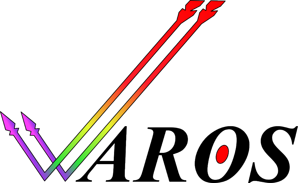
The arrow-check recalls Amiga's check, the arrows are a play on the name "AROS", the rainbow recalls that of the original Amiga logo, as does the font, and the bullseye-"O" links the text with the arrows.

Below is a smaller version:


Below is the current AROS logo for comparison:


What do you think?
 

Offline anglosaxonusaTopic starter

  • Newbie
  • *
  • Join Date: Dec 2010
  • Posts: 33
    • Show all replies
Re: Logos vs Mascots (AROS)
« Reply #1 on: December 09, 2010, 10:53:47 PM »
The cat mascot doesn't bother me so much as the font chosen for their logo.  What does the Klingon font have to do with the cat?  How are they related?

Also, how are they both related to the Amiga?  I'm not seeing it...
 

Offline anglosaxonusaTopic starter

  • Newbie
  • *
  • Join Date: Dec 2010
  • Posts: 33
    • Show all replies
Re: Logos vs Mascots (AROS)
« Reply #2 on: December 09, 2010, 11:02:43 PM »
Quote from: the_leander;597951
As for the font... Why does a font have to be "related" to the Amiga?

Why shouldn't it be related?  AROS has Amiga roots, correct?
 

Offline anglosaxonusaTopic starter

  • Newbie
  • *
  • Join Date: Dec 2010
  • Posts: 33
    • Show all replies
Re: Logos vs Mascots (AROS)
« Reply #3 on: December 09, 2010, 11:10:59 PM »
Second shot (changes to the fletching):


Offline anglosaxonusaTopic starter

  • Newbie
  • *
  • Join Date: Dec 2010
  • Posts: 33
    • Show all replies
Re: Logos vs Mascots (AROS)
« Reply #4 on: December 11, 2010, 06:52:12 AM »
I made this just for fun:


A close up:


Offline anglosaxonusaTopic starter

  • Newbie
  • *
  • Join Date: Dec 2010
  • Posts: 33
    • Show all replies
Re: Logos vs Mascots (AROS)
« Reply #5 on: December 11, 2010, 06:52:55 AM »
Quote from: adz;598116
If you wanna know what I think, well you probably don't but that's never stopped me before :lol: I reckon it looks a tad dodgy, kinda like something cobbled together in mspaint.

Thanks for being candid.
 

Offline anglosaxonusaTopic starter

  • Newbie
  • *
  • Join Date: Dec 2010
  • Posts: 33
    • Show all replies
Re: Logos vs Mascots (AROS)
« Reply #6 on: December 11, 2010, 10:57:13 PM »
Quote from: AmigaNG;598163

 
I think it looks pritty good next to the intel inside sticker, it basicly my old avatar I made, which any one is welcome to.


My fiancĂ© really got a kick out of the blinking.  Great job!
 

Offline anglosaxonusaTopic starter

  • Newbie
  • *
  • Join Date: Dec 2010
  • Posts: 33
    • Show all replies
Re: Logos vs Mascots (AROS)
« Reply #7 on: December 11, 2010, 11:01:30 PM »
Quote from: kolla;598177
The arrow is resting on the wrong side of the bow - the arrow will bounce off and she'll most likely miss whatever she's aiming for. I just wanted to point that out :)

Here was the inspiration for the picture:


Offline anglosaxonusaTopic starter

  • Newbie
  • *
  • Join Date: Dec 2010
  • Posts: 33
    • Show all replies
Re: Logos vs Mascots (AROS)
« Reply #8 on: December 12, 2010, 05:13:13 AM »
Third shot:


Detail shot 1:


Detail shot 2:


The image appears to read well at a small scale:


The heart is a play on "Eros" (love) and the assorted cupid connotations.  The arrow is a phonetic play on AROS.  The target-"O" is a foil for the arrow.  The drawing of the cat "arching" links the logo with the mascot, and the mascot herself, links with Eros through her sexyness.
 
The image (like the drawing of the cat) are scalable vector graphics and can be scaled to any size. I'm using photobucket to host the svgs as pngs, which caused some quality loss in what you see.
 
What do you think?
 

Offline anglosaxonusaTopic starter

  • Newbie
  • *
  • Join Date: Dec 2010
  • Posts: 33
    • Show all replies
Re: Logos vs Mascots (AROS)
« Reply #9 on: December 12, 2010, 05:44:26 AM »
Quote from: EDanaII;598237
Since you wanna draw allusions to AROS's roots, maybe switch the bull's eye for a (red and white checkered) dart board? Just a thought. :)

Brilliant! I'll see what I can come up with...
 
I tried integrating the gradient into the arrowshaft but it didn't come out right. The yellow shaft seems to work a lot better than rainbow gradient when tying it all together:


Offline anglosaxonusaTopic starter

  • Newbie
  • *
  • Join Date: Dec 2010
  • Posts: 33
    • Show all replies
Re: Logos vs Mascots (AROS)
« Reply #10 on: December 30, 2010, 03:20:09 PM »
Quote from: hardwired;601061
I've a small blog in that I write about AROS development, technical aspects, features and some PR from time to time...


But my last post is all about AROS mascot Kitty... A well known character of the community but has been forgoten for a while and does not gather the sympathy of newer (and even some older) AROS users/fans!
 
So it's time time to address that - read the full post on:
Blog post - AROS Kitty!
 
I believe that AROS mascot needs more work such as the one from anglosaxonusa. Great work!
 
@anglosaxonusa
Do you made this with a vector art package? Can you provide the vector file if so?

No problem.  Send me a private message with your e-mail and I'll send off the SVG.  The drawing was made with InkScape (on Windows), FYI.