Second shot (changes to the fletching):
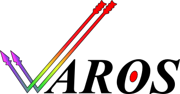
While I don't prefer your design over the current official AROS Logo, I do like your approach. A nice clean logo. At first I didn't understand why you were using actual "fletched" arrows in the checkmark until the similarities between the pronounciation of AROS=ARROWS dawn on me! Good one! I had never associated AROS with "ARROWS" (I guess in my head I had always used a long vowel sound).
